Designing Iraq's First Flight & Hotel Booking App - From Zero to Launch
Rahal - a native Arabic booking experience designed solo in under three weeks, while building a foundational RTL design system from scratch
12.4% Search-to-checkout conversion rate
Outperformed global travel industry benchmarks by over 3x
300,000+ Monthly active users
Scaled rapidly across Iraq with a custom-built, Arabic-first design system
3,400+ Monthly bookings
Achieved record platform sales through a streamlined, low-friction checkout flow

Rahal is a travel app built to help Iraqi travelers - and increasingly others across the region - book flights and hotels with confidence, backed by flexible payment options like Buy Now, Pay Later. I joined as the solo product designer with one job: take it from nothing to a working MVP in two to three weeks, then keep building it into a fully scaled platform over the following two years.
What follows is less a straight line and more a series of calls I had to make with incomplete information - starting with the fact that nobody, including me, fully knew what this app should be yet.
Client:
Rahal / Digital Zone
Role:
Senior Product Designer
Year:
2025 - 2026
In roughly three weeks, that ambiguity turned into a working MVP. Over the following 18 months, it turned into a platform serving 300,000+ monthly users with a conversion rate that nearly tripled - the numbers are in results, but the decisions that got there are the actual story.

There was no documentation, no defined scope, no list of what the API could and couldn't do. What I had instead was closer to "we want something like this - go build it" a third-party booking API nobody on the team had fully mapped yet, and a deadline measured in weeks, not months.
That meant the first real work wasn't designing screens. It was framing the problem myself, because nobody was going to hand it to me framed. I talked to developers to understand what the API could support, and separately, what it could support in time - those were often different answers, and I had to design around the gap between them. I was building the picture of the product at the same time as the product itself.

Designing for two completely different kinds of users
Some of Rahal's users already had a mental model for booking apps, carried over from whatever they'd used before. A large share didn't - no established digital patterns at all, no assumptions about how a screen like this should behave. The app itself had to do the teaching: clear, explanatory guidance built into the flow, not a set of features that assumed prior app literacy.
Working with an API nobody had fully mapped yet
The booking engine was a rigid third-party system with no clear documentation of its limits. Every design decision ran through a loop of asking developers what was possible, then asking what was possible within three weeks - those were often different answers, and I had to design around the gap between them rather than around the user.
Making Buy Now, Pay Later impossible to miss,
without making the screen worse
The business needed BNPL prominent from day one, because it was tied directly to a revenue goal - not just a feature the business liked, but one they were counting on to move a number. My job was to give it real visual weight without letting it crowd out the booking flow itself or confuse first-time users already unfamiliar with the format. Getting that balance wrong in either direction had a business cost, not just a UX one.

Discovery
With no documentation to work from, I built my own - a working brief that turned "something like this" into an actual list of what needed deciding. I spent a lot of that early period just talking: to developers, to understand real API constraints; to the client, pushing back gently where I thought the product needed more than what was asked for. Since I had no direct access to Iraqi users during the MVP phase, I used the client's own team as a working proxy for regional taste and habits - what colors read as trustworthy, what patterns felt familiar, what didn't. Alongside that, I studied regional competitors like Almosafer, borrowing booking patterns people already trusted rather than importing Western UX conventions into a market where they hadn't earned trust yet.

The decision I had to defend
The MVP deadline didn't leave room to design a system from a blank canvas. Netguru had a brand new design system, Silk, still in draft - and it was built for Latin-alphabet, left-to-right products. No RTL support at all. Several components didn't match the client's brand once we saw them side by side - wrong button shapes, wrong colors, input fields that didn't fit.
I chose to build on it anyway. The alternative - designing a full system from zero under a three-week deadline - simply didn't fit the timeline. I took Silk as a starting point rather than a finished toolkit, knowing I'd likely end up rebuilding a large share of it. That's what happened: full RTL support built in, brand-matched components redesigned from the ground up, and travel-specific components that didn't exist yet designed from scratch. Rahal ended up running a genuinely different version of Silk than the one I started with - but it meant I had a working foundation on day one instead of nothing.
Building it
Because the API was so rigid, I mapped the system logic before sketching a single screen, to make sure neither users nor developers would hit a technical dead end later. From there: structural mockups focused on clear, familiar navigation from search to checkout, and an MVP strategy that kept scope to core utility - search, select, checkout - with more complex filtering deferred until after launch.

Not everything made it into the MVP, and it's worth saying plainly what didn't. Seat selection for flights was cut - not because it was hard to design (a day or two of work), but because it was expensive for developers to build inside the timeline, and the tradeoff didn't make sense yet. Baggage information and some additional services went the same way; we couldn't get them to a state that worked within the deadline, so they waited. These weren't failures so much as real calls about where three weeks of engineering time were best spent - and both were candidates to revisit once the MVP had actually shipped and proven the core flow worked.
Before locking in the final direction, I presented the client with three or four different design approaches for how the app could look and feel. There was no time or budget for formal user testing at this stage, so validation came from a structured internal review instead - the client's stakeholders, their in-house graphic designers, and Netguru's developers all weighing in together. One direction held up clearly against the rest, and that became the foundation everything else was built on


Initial name of the app was Travel Zone, but it changed during the design process
By the end of the MVP phase, Rahal was running a version of Silk that looked meaningfully different from where it started. RTL support didn't exist in the original system, so I built it in from the ground up. Beyond that, I updated 50+ components to match the client's brand and designed the travel-specific pieces - flight and hotel-specific patterns - that a general-purpose system was never going to have out of the box. Rahal effectively became Silk's first real-world stress test, and a lot of what the system does well today traces back to problems this project surfaced first.

Silk design system integration
Instead of starting from zero, I used Silk - Netguru's brand-new design system. Rahal was actually its first real-world test run! It gave us a huge head start, but we still updated 50+ components for our Arabic audience, and designed missing travel-specific features from scratch.
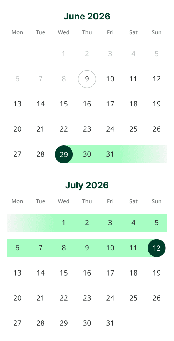
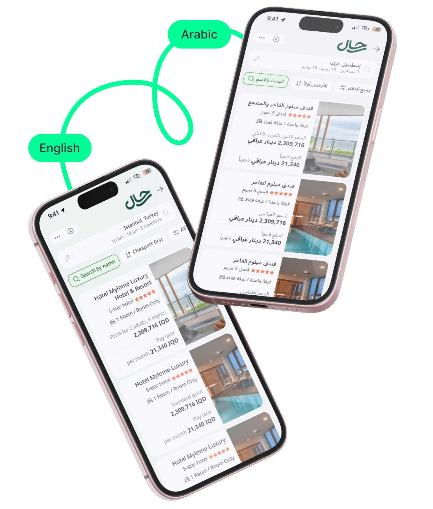
The final design shipped with full RTL support from day one - every screen, from the Arabic home screen to flight details, the custom date picker, and the hotel booking flow, built natively right-to-left rather than mirrored as an afterthought.


Home screen
in Arabic language

Flight details

Custom date picker
Hotel room booking flow


The checkout flow guides users step by step in native Arabic, removing friction and cutting cognitive load all the way through to payment.

Flexible payment process
Instalment payment plans made travel more accessible, which meant folding multiple price points and fees into a checkout that still felt clean and low-stress.


Curated tours & getaways
Predefined tour trips let travelers book a complete flight-and-hotel combination in a few taps, instead of assembling one manually.

Launch was the start, not the finish. I used PostHog funnel data and direct user feedback to find where people were actually getting stuck.
Fixing drop-off rate in flight details page
A 41% drop-off at the Flight Details screen traced back to the same rigid API - it couldn't load content simultaneously, which meant jittery screens that overwhelmed users. Introducing progressive disclosure (hiding secondary details until requested, clarifying baggage rules) cut abandonment from 41% to 27%.

We introduced progressive disclosure - hiding secondary details until requested and clarifying baggage rules.
This simplified the experience and cut abandonment from 41% to 27%.
Smoothing out the final steps
Users were hesitating during traveller selection, and post-purchase feedback showed they wanted more reassurance right after paying. Smoothing out traveller selection and revamping the Success Screen - surfacing key flight details immediately - gave users that reassurance and cut drop-off at both points.

We smoothed out the traveler selection flow and revamped the Success Screen to show key flight details upfront, giving users instant peace of mind.
More clean traveller selection
PostHog analytics and user feedback showed the same picture - our traveller selection flow was simply too complex, causing a massive spike in drop-offs.

Design improvement decreased the drop off rate in traveller selection step, made the transition more clear
By analysing PostHog funnel data post-launch, I validated a 10.6% search-to-checkout conversion rate - peaking at 12.4% on Android, which nearly tripled the 3.5% travel industry benchmark. Scaling to 300,000+ monthly active users proved that a native, RTL Arabic-first experience truly resonated with the market. At its peak, the flow processed 3,400+ monthly bookings (over 2,800 flights and 600 hotels) - a platform MVP of which was designed solo in under three weeks.
Optimized Task Speed
Streamlined the selection flow, enabling 56% of converting users to navigate from flight details to completion in under 4 minutes
Exceeded Benchmark Conversion:
Achieved a 12.4% checkout rate on Android, far surpassing the 3.5% industry average for travel booking apps.
High-Accuracy Discovery:
Designed a search-and-filter experience so intuitive that 74% of users found their flight on the first search without adjusting parameters.
Data-Led Optimization:
Conducted funnel telemetry audits that pinpointed technical API blockers and missing analytics events, providing actionable engineering fixes to unlock lost revenue
High-Accuracy
Discovery:
Designed a search-and-filter experience so intuitive that 74% of users found their flight on the first search without adjusting parameters.
Exceeded Benchmark Conversion:
Achieved a 12.4% checkout rate on Android, far surpassing the 3.5% industry average for travel booking apps.
Optimized Task Speed
Streamlined the selection flow, enabling 56% of converting users to navigate from flight details to completion in under 4 minutes
The biggest constraint on this project was never the design - it was the ambiguity. There was no documentation, no user access, and a system that didn't fully support the language it needed to launch in. Using the client's team as a proxy for user taste got the MVP to something credible, but the real usability wins - the flight-details fix, the traveller-selection cleanup - only showed up once we had actual usage data to learn from. If I did this again, I'd push to get that data flowing even earlier, instead of waiting for a full post-launch phase to start listening.
I worked with Said on the Rahal project and we had a very close working relation as his direct manager for almost 8+ months and Said had massive contribution to Rahal's growth since it's inception and more so in later stages, his contributions were meaningful and drove impact
Amr Ali
Product Owner, Rahal
I definitely like it when designer understands the project situation and is able to adapt to it. Our project was very fast and we had a very tight deadline to deliver and feedback everything with the client as well as establish the entire logic with the developers. He is a guy who can act like that and adapt to the circumstances.
Piotr Swierkowski
Senior Product Designer, Netguru
What I really appreciated was how well Said understood the technical limitations of our project. He consistently took them into account, which made a huge difference - sharing that understanding meant we ended up with great designs that required a reasonable amount of implementation work.
If it were up to me, I'd pick Said as a designer 10 out of 10 times for any future project.
Konrad Kruczek
Senior Backend Developer, Netguru

